01 December 2023
Steenbergs Rebranding - How We Created Our New Branding
It’s been an exciting 20 years since we started out on the Steenbergs journey. Our mission to provide ethically-sourced, flavour-packed herbs, spices, teas and cooking ingredients still burns as strong as ever.
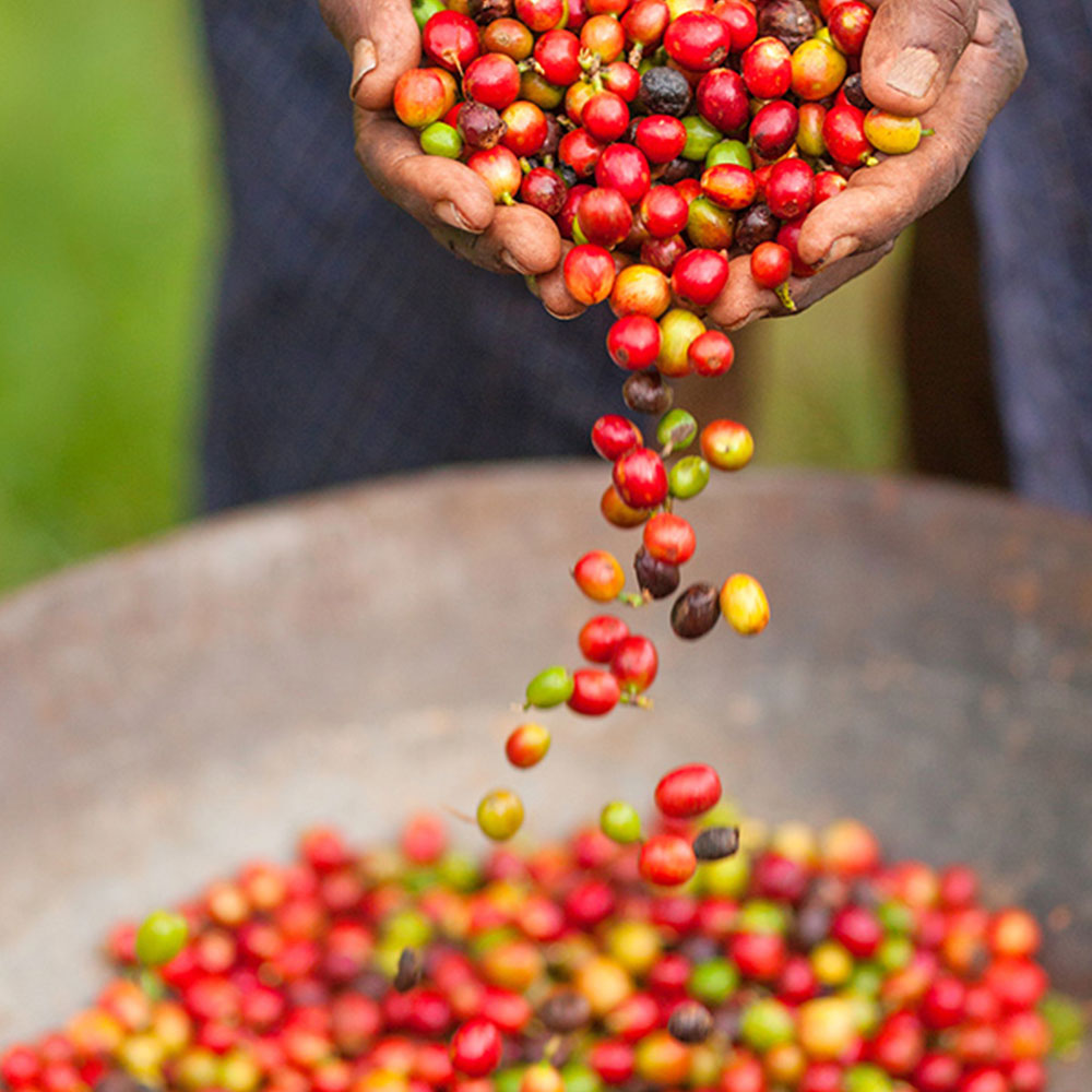
In that time, we’ve unearthed some of the best quality produce from around the world, many of which are Fairtrade and organic, worked closely with some of the best producers, built a carbon neutral production facility in beautiful North Yorkshire and recently been awarded the prestigious B Corp accreditation. And we delight in the idea that our herbs, spices, teas and ingredients are at the heart of people’s delicious dishes and drinks.
But something didn’t seem to quite fit with what we had achieved. We realised that our branding and packaging design didn’t quite live up to how we wanted to be seen. So, we decided to update our look. But how and what should we change?
After meeting with a few designers, we turned for help to brand designers Wonderland Design who have years of experience working with organic and ethical brands that include Planet Organic, Marigold Health Foods, Tims Dairy, Brecon Carreg and Ibis Rice. Together, we worked towards better defining what the Steenbergs brand stood for and how that could help inform not only our branding but our whole look and feel across all our marketing communications.
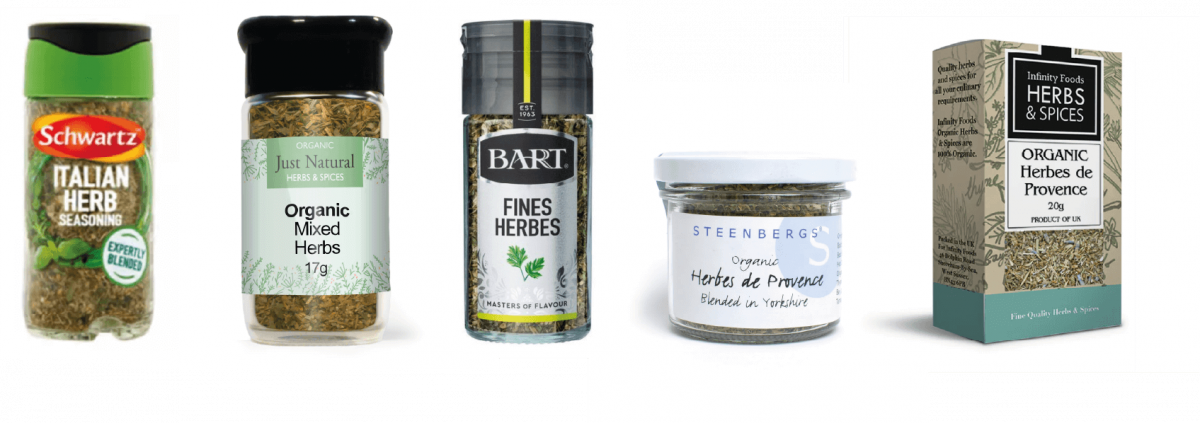
First things first. We looked at how we performed on shelf against some of key competitors. Steenbergs didn’t stand out well enough nor did our individual on pack product communications inspire shoppers. Our original homespun style, with a stripped-back Scandinavian feel that reflected Axel's Danish heritage, no longer worked. We really needed to change.
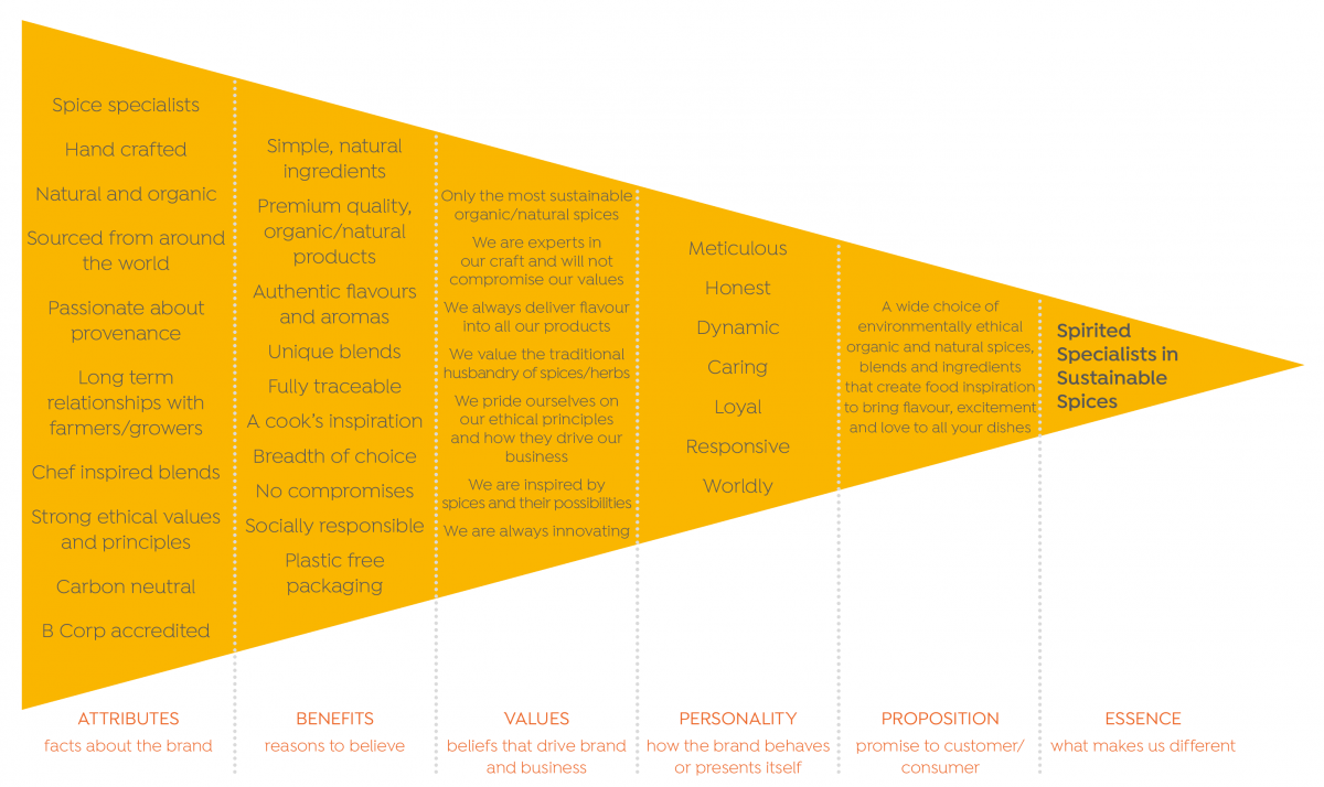
The brand model: we had a session to give Wonderland a good sense of who we are, what we do and what is important to us. This was taken and crafted into what is called a brand model. This included our attributes (facts about the brand), benefits (reasons to believe), values (how we want to be seen), personality (brand behaviour), consumer proportion (promise to the consumer) and overall brand idea (overall brand essence). This was also supported by how we see our mission and vision.
Design ideas: the agreed brand’s idea, Spirited Specialists in Sustainable Spices, was used to inspire a range of creative directions that could be used to reflect what the brand stood for. These directions informed a number of design concepts applied to both a range of spices and baking ingredients packs as well as how an Instagram feed might look. This gave us a good idea of not only how our new packs might look but also how a brand look and feel might evolve. We also had a good sense of how brand tag lines might work as well as how products and their individual benefits could be presented.
It was tricky to narrow the options down as we liked quite a few! We spent a long time considering our favoured options - which ones worked best with how we saw Steenbergs and which options best communicated the idea behind the brand.
It was a fun process but we also knew that we had some serious decisions to make - after all, this was the future of our brand!
Down to four: there were four routes we wanted to be developed, each with some carefully curated feedback as there were some routes NOT chosen that used colours, treatments or messaging in a way that we liked. Further design developments, and we had an emerging favourite, again with some design developments that we wanted the design team to consider.
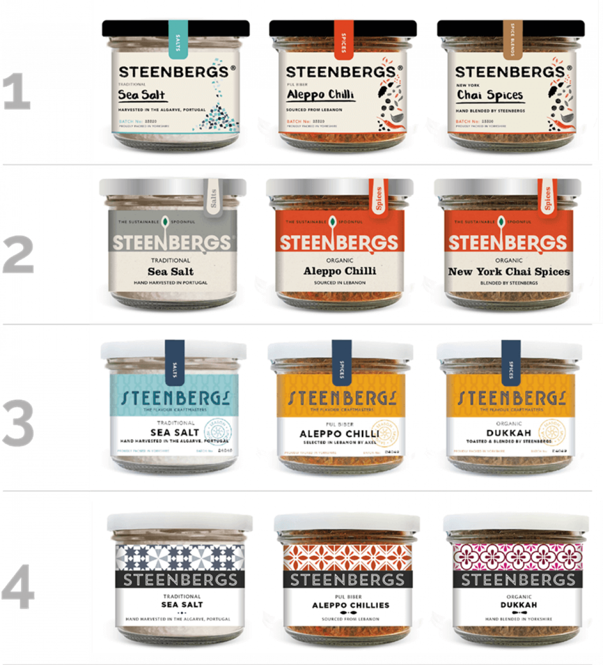
The chosen design: following further refinements, we were clear about which design for the branding and pack graphics was working for us. But we wanted to make sure!
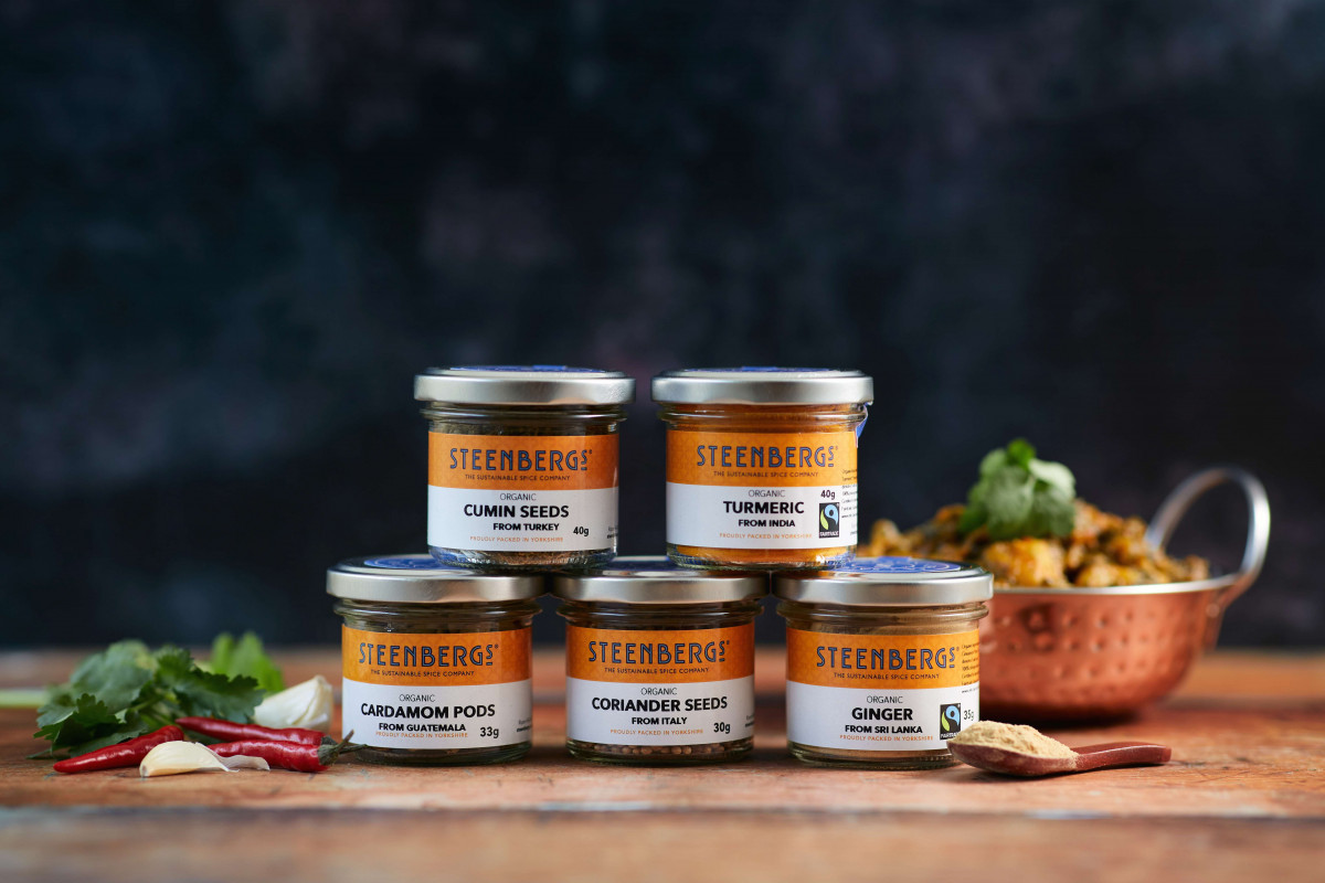
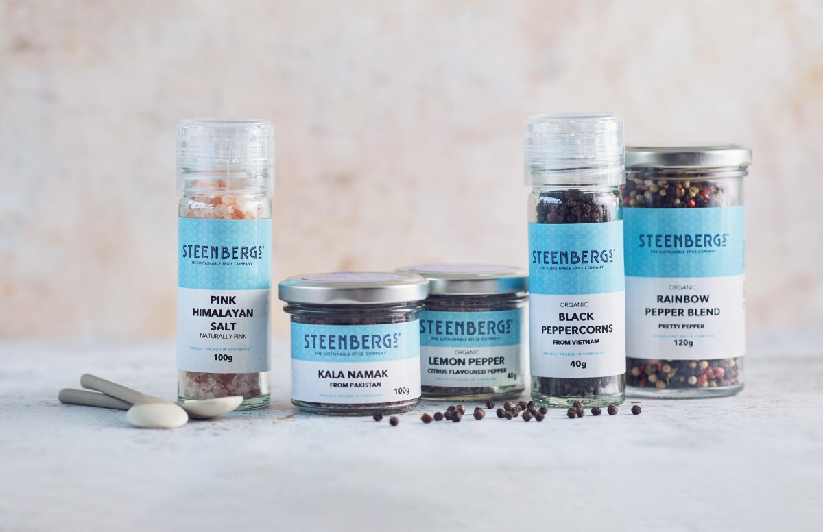
Onto shelf: as the design across a representative range of spices and ingredients emerged, we needed to make sure that they worked on shelf. So, mock ups were produced for a selection of products and these went onto shelf to see how colours, type and messaging worked. This told us a lot and we were able to optimise the labels based on seeing how the mock ups performed on shelf.
Finalisation: now it was a case of crafting the branding, making sure the colours could be produced to the right standards and that the artwork templates contained the right mix of Fairtrade and Organic Food Federation and vegan logos. Not forgetting the need for a consistent approach in the application of all label content across all the different sizes of labels and across the range of spices and ingredients.
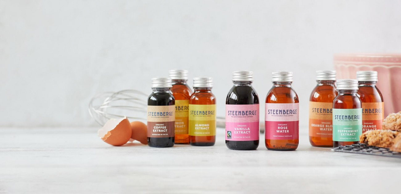
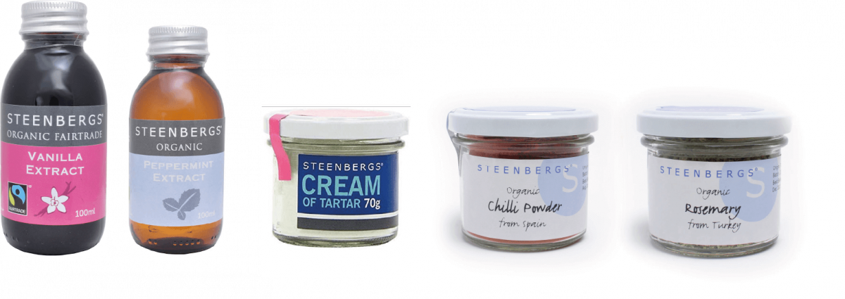
We’ll be rolling out our new packaging over the coming months and across our website. The new branding is already on our core range - organic spices and seasonings in jars and our organic extracts and flower waters in bottles - and we've refreshed the website with the new logo and some beautiful photography by Olivia Brabbs.
With our new branding and packaging, we’re ready for the next 20 years!